CASE STUDY
GYPSY MOON WINERY
Gypsy Moon Winery is a family owned boutique winery in St. Albert, Alberta. At Gypsy Moon Winery, the customer can choose a wine kit made with grapes from vineyards around the world to be fermented using professional equipment.
THE PROJECT:
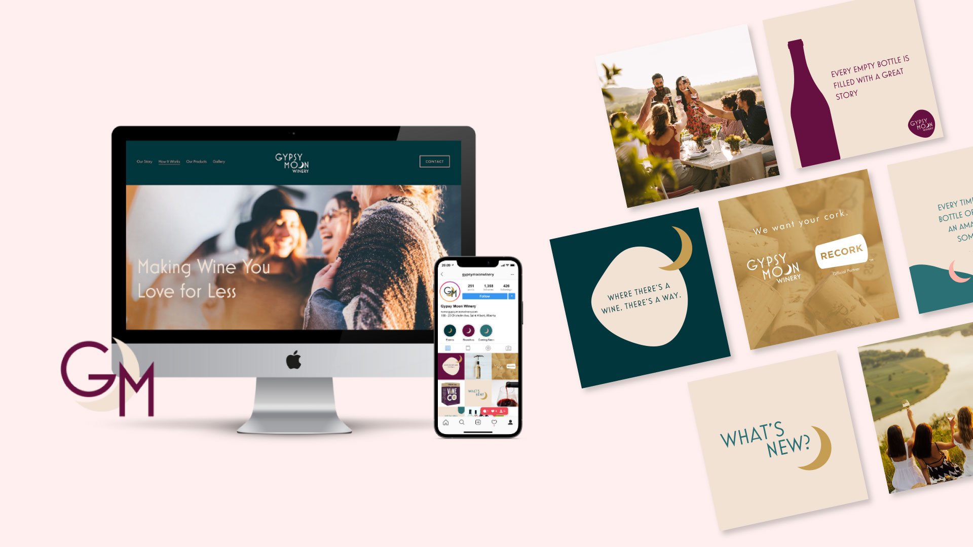
Like many other businesses, Gypsy Moon began their journey by ‘DIY’ing their logo and website. Their brand identity and story was unfortunately not shining through in their marketing and as their business grew, they realized the immense importance of a strong, recognizable brand. We had the privilege of helping them uncover their story and create a strong strategy and brand identity.
OUR MARKETING SOLUTION:
BRANDING
Brand Strategy, Brand Identity, Brand Design & Canva Brand Kit
WEB DESIGN
Website Audit, Website Refresh & Copywriting
THE PROCESS
BRANDING
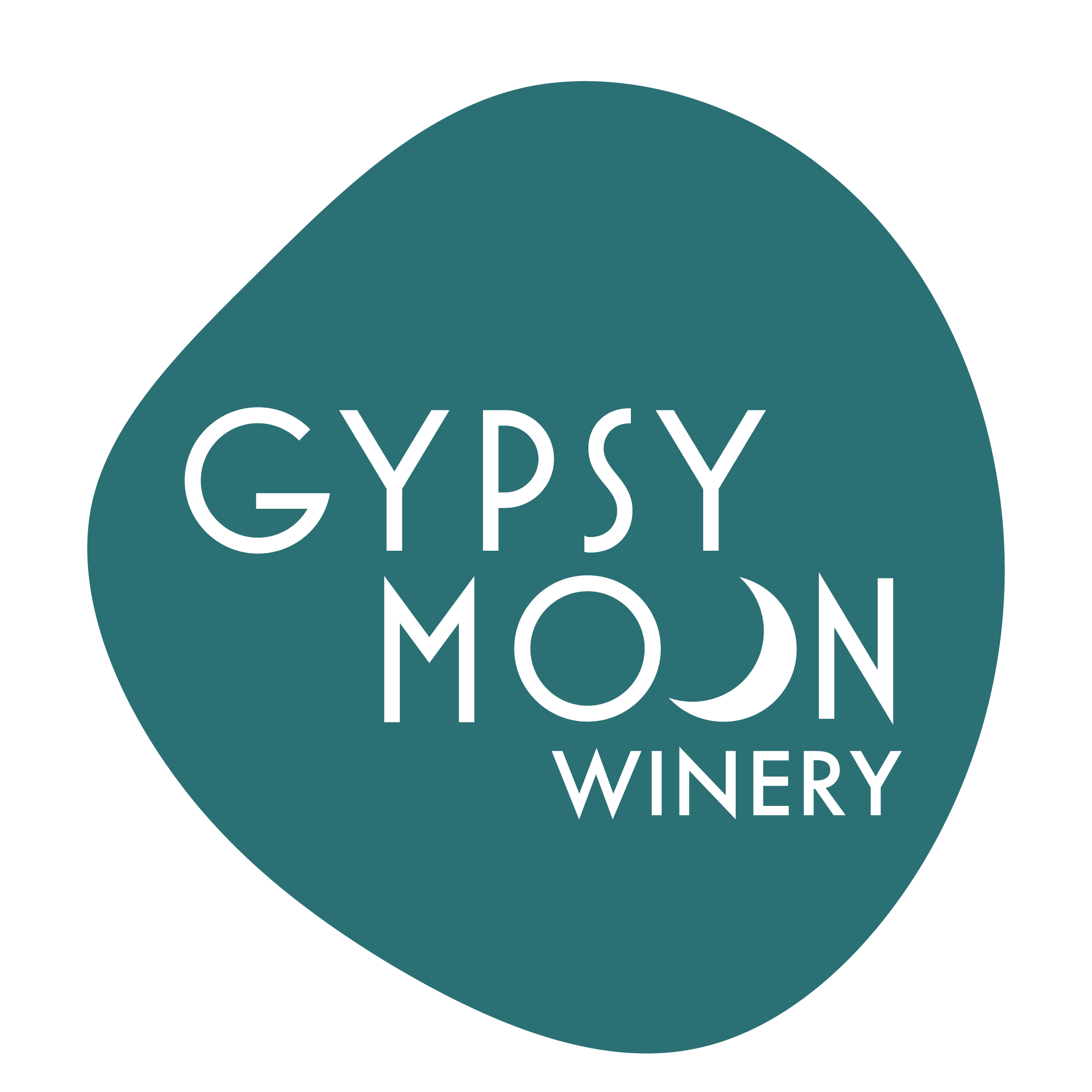
We began our brand design with some mind mapping and brainstorming before diving into extensive visual research to help us understand the style and feel Gypsy Moon Winery desired for their brand refresh. From there, we created two different branding and identity concepts to present to our agency partner.
Concept #1 had a modern, art deco feel. The O’s from the word moon were used to represent both the moon as well as bubbles, an homage to wine. The overlapping circles were also reminiscent of ‘cheersing’ glasses which highlights Gypsy Moon’s emphasis of creating long lasting relationships with their customers. The rich and bold colour palette adds depth and complements the modern style.
Concept #2 had a contemporary and playful feel. The decorative serif font uses a mix of thin and thick strokes which provides great contrast and shape. This font pairs well with the sans serif supporting font which is used for ‘winery’. The second ‘O’ in moon is made to symbolize a crescent moon which subtly references their previous logo.
After presenting both concepts to our agency partner, we collectively decided to combine both concepts into one, using the modern typeface from Concept #1 paired with the contemporary and playful feel from Concept #2. We used the crescent moon shape for the “O” in moon to pay homage to their previous logo and brand story.

SOCIAL MEDIA
Once we created a visual branding system, we were able to create a Social Media Brand Kit to use on their social media accounts. When creating this Social Media Brand Kit, we were tasked with the challenge of integrating branded content from the products that they sell.
We designed several customizable Canva templates for them to seamlessly integrate their brand identity into their social media accounts. We provided them with ways to showcase their products without taking away from their own branding.
WEBSITE
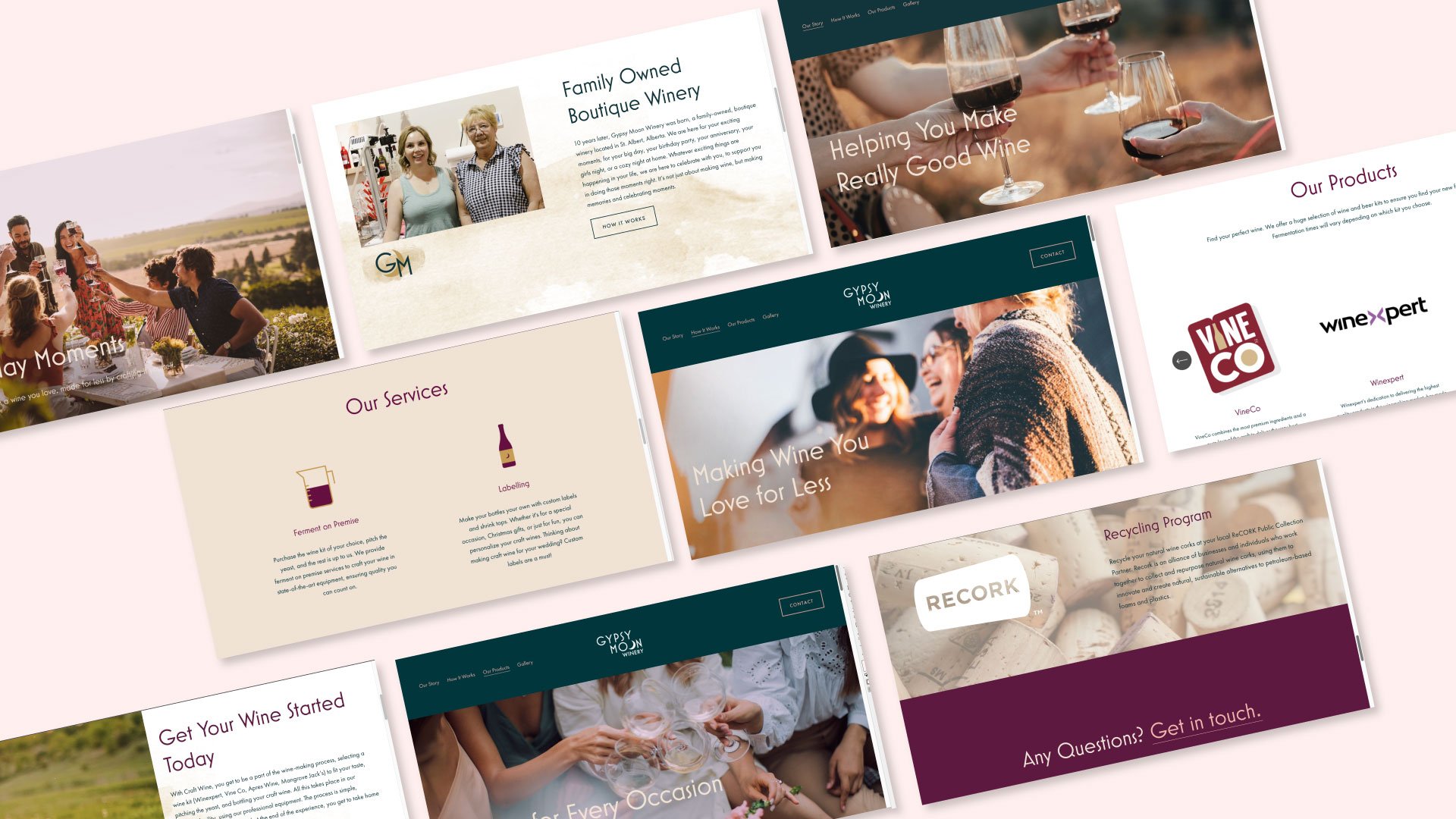
We begin this process with an extensive website audit to see where we can make improvements for both the agency partner as well as the user.
Our main focus for this website refresh was to tell Gypsy Moon’s story and extend their brand voice on to their website. With copywriting we were able to tell their story and we paired it with their new branding and branded photography as well as sourcing stock images that reflected their brand identity.
In addition, we were also tasked with the challenge of showcasing their extensive product lists from various brands while still maintaining a consistent brand voice.
THE RESULTS
Created a strong and comprehensive visual identity.
Provided them with Canva templates to showcase their products without taking away from their own brand identity.
Organizing and showcasing their extensive product lists from various brands while still maintaining a consistent brand voice.


